... Skip to content

Author: Brad Johnson

Brad Johnson is an author and blogger who helps writers discover their niche, build successful habits, and quit their 9-5. His books include Ignite Your Beacon, Writing Clout and Tomes Of A Healing Heart. For strategic content and practical tips on how to become a full-time writer, visit: BradleyJohnsonProductions.com.

Hit the like button if you love this info!

https://feeds.feedblitz.com/~/617811938/0/convinceandconvertconsulting/
How to Create an Effective Press Page to Attract Coverage and Links

Would you like to receive more story requests from bloggers and journalists? Don’t you want to see more and more news stories mentioning your brand? Your first step to building more online coverage is to create an effective press page.

Why Create a Press Page?

I lost count of how many times I wanted to reach out to a brand (usually that’s a marketing tool I was curious to explore further) and struggled to find any clear instructions on how. I’ve also lost track of how many times I gave up when trying to mention a brand on Twitter and couldn’t find their Twitter handle anywhere.

Those brands missed a nice opportunity of being mentioned (which could even be a missed opportunity of onboarding a new brand advocate).

A well-built press page would have made that opportunity a reality.

Fundamentally, the major goals behind building a press page are:

  • Attracting “linking leads” (i.e. bloggers and journalists) by making your brand look interesting to them.
  • Delivering clear instructions on how they can get in touch (without leaving them wondering).
  • Providing you with a little bit more control over the online sentiment surrounding your brand (by surfacing favorable mentions).

Should You Create a Press Page or a Press Site?

There are certain pros and cons to setting up a dedicated site to curate news and encourage press contacts.

The biggest benefit of having a separate site is an ability to take more than one position in Google for your branded queries. Google is trying to show diverse results per SERPs, aiming to show no more than two results from the same domain for a particular query in the top results. So having additional sites will help you control more of your branded search SERPs.

Bigger companies usually have several domains building additional online context around the brand (and controlling more branded SERPs):
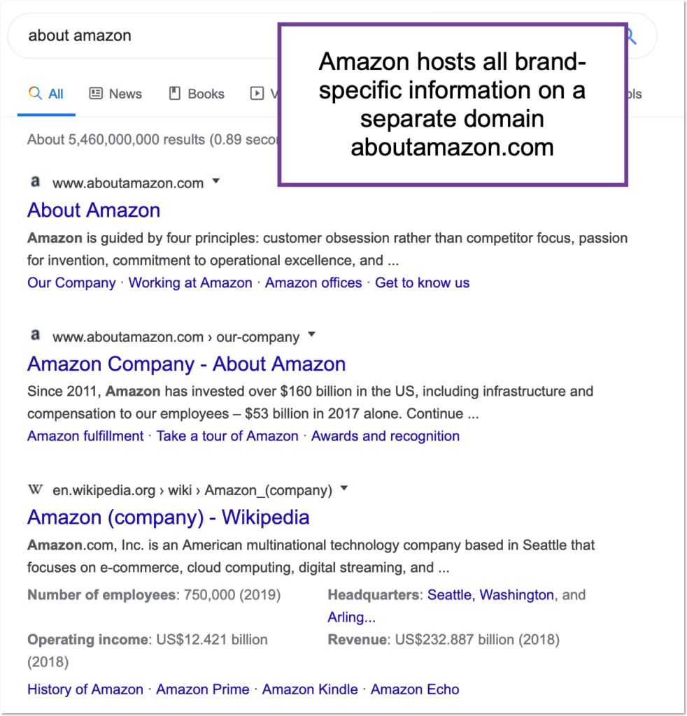
Amazon Press Site Example

Amazon hosts all brand-specific information on a separate domain aboutamazon.com

Radix offers a perfect domain name for your brand’s press room: .press:
Radix press domain ideas

Radix press domain ideas

On the other hand, building a separate site comes at a price: You need additional resources to build, design and maintain a separate entity.

I leave it up to you to decide, but I am personally leaning towards a separate entity option.

1. Past Mentions

There are a few important reasons why you want to curate your current press coverage:

  • Linking to pages that mention you will boost rankings of those pages. This helps you surface your positive mentions and, hence, better control your company’s online sentiment.
  • Featuring various stories around your brand gives journalists more ideas of possible angles for their own articles.
  • Publicizing your mentions encourages more bloggers to feature you (in hopes you will link to them from that section as well).
  • “As featured in” section offers you the power of social proof. Both your customers and journalists will trust your brand more once they see you are being covered in the news.

This section may contain all kinds of links that mention your brand in one way or another, including:

  • Your mentions in the news outlets.
  • Your management’s interviews.
  • Articles quoting you or your management.
  • Your CEO’s keynote coverage, etc.

It is also a good idea to curate your own press releases in this section.

Nextiva does a great job curating news coverage of their brand:
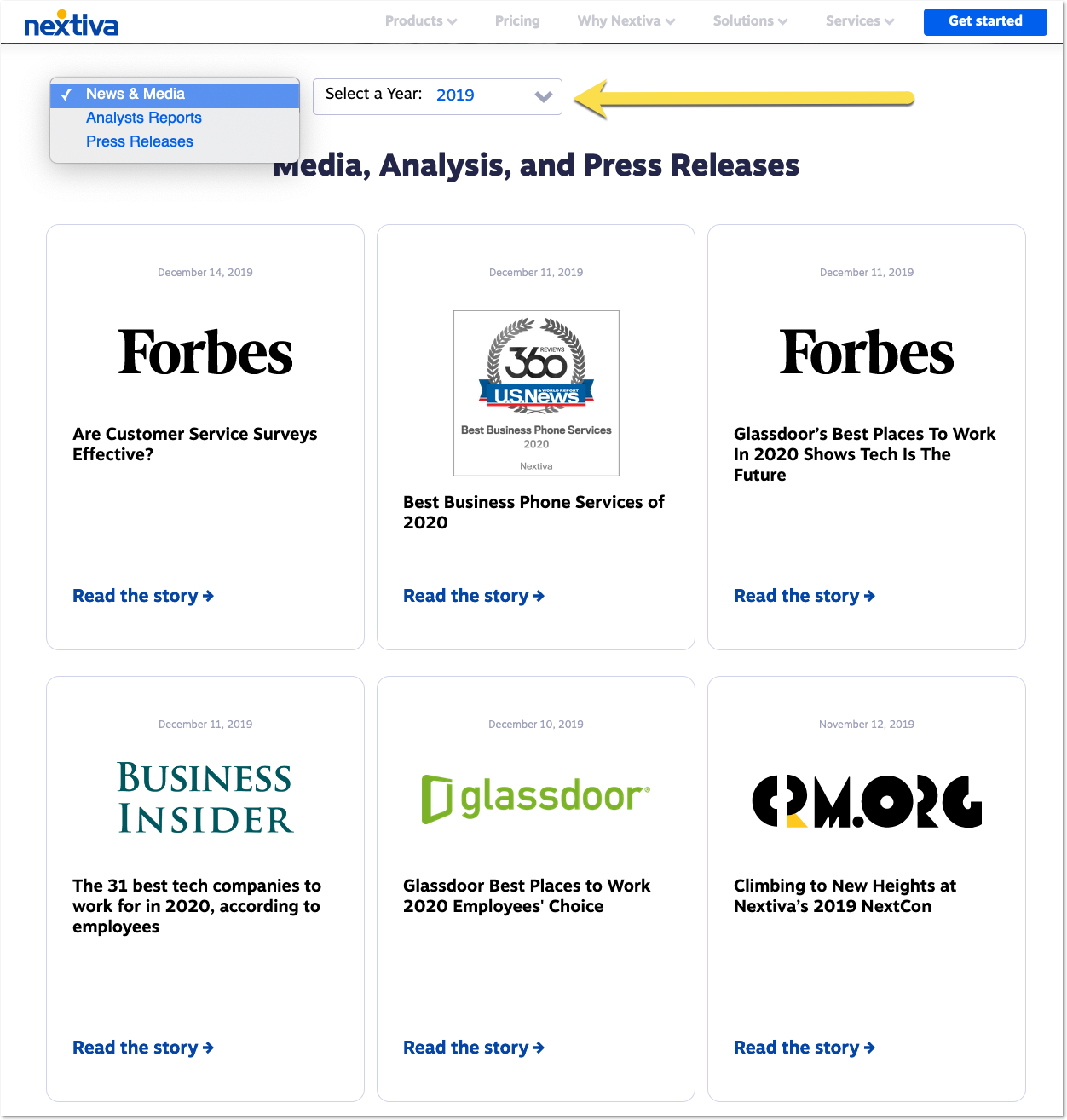
Press Page Example

Great press page example from Nextiva. You can sort the list by year to find older / newer stories featuring the brand.

You can sort the list by year to find older / newer stories featuring the brand.

2. Contact Information

The best idea is to put a real person here, instead of a generic contact form. EPAM is a great example of doing that well:
Press page example with press contact

Great example of highlighting your press contact on your press page.

Knowing who to contact and being able to choose from a variety of options is likely to encourage many of your company’s linking leads to start the conversation.

3. “Behind-the-Scenes” Company Information

Again, one of the major goals behind a good press page is to make your company more interesting to bloggers and journalists, encouraging them to think of it as part of a story.

What’s a better way to make your company more interesting to people than by humanizing it. Show your team, your pictures, your conference trips, your charity events. You have a lot of uniqueness in your brand. Just show it.

4. Style Guide/Assets

Offering bloggers and journalists additional assets to include in their articles may incentivize them to create a more eye-catching context.

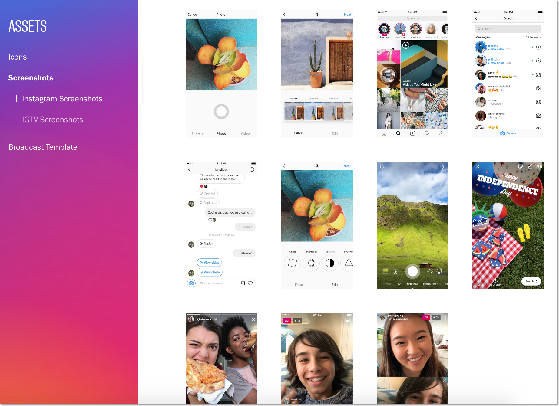
Instagram is a good example of providing exhaustive instructions as to how bloggers may be using their logos and where to download a high-resolution file. They also offer high-resolution screenshots for download and use within articles:
Style Guide/Assets example for a press page from instagram

Instagram’s asset collection is a great example of a style guide and assets for press to use

5. Your Social Media Channels

Finally, offering additional ways to get in touch is always a good idea. Plus, linking to your social media channels will allow bloggers and journalists to tag you in social media updates when your feature goes live.

Besides, encouraging your linking leads to follow you around would tie them closer to your brand and potentially keep them engaged.

Optimize Your Page for Organic Visibility

Finally, getting your press page (or site) rank for a variety of branded (and possibly even generic / non-branded) queries is key to generating more press coverage.

Text Optimizer will help you create an effective copy for your Press Coverage, which will help it rank higher in Google. Text Optimizer will check your current brand-name ranking and use semantic analysis to extract related concepts for you to include them in your copy:

It is also a good idea to come up with a user-engaging strategy making sure people who have found themselves on our press page will continue browsing the site.

Alter offers a few great user engaging options, including exit-intent popup that shows up exactly when your site users are ready to leave. You can control the pages that will show up and the content they will include:

Conclusion

So many companies are getting proactive with link acquisition and press coverage tactics, yet they forget the inbound aspect of them. Before investing in your journalistic email outreach, make sure you have a convincing landing page set up. That way, linking leads will know why and how to mention you when providing the coverage.

Setting up a press page (or a press site) is a one-time task, but it must be done in order to see your brand generating more and more organic mentions around the web.

The post How to Create an Effective Press Page to Attract Coverage and Links appeared first on Convince and Convert: Social Media Consulting and Content Marketing Consulting.

Hit the love button if you love this info!

https://conversionsciences.com/best-definition-of-conversion-rate-optimization/

Having trouble viewing the text? You can always read the original article here: The Best Definition of Conversion Rate Optimization Ever Written

Who better than a scientist to come up with the best definition of conversion rate optimization ever? Read on. Be the Judge. What exactly is conversion rate optimization? You’ve read about it over and over, but you may not have a proper understanding of how to apply it to your ecommerce store or to your […]

The post The Best Definition of Conversion Rate Optimization Ever Written appeared first on Conversion Sciences.

How Love Turns You Into a God

Most of what I learned in college was useful. Not practical, often, but socially or existentially helpful. The glaring exception is an idea I picked up God knows where, and clung to for five bleak years: that love meant losing control. True romance, I thought, should feel abject. It should be a descent. 

Unsurprisingly, this concept of romance led me away from a very kind boyfriend, and toward a very bad one. It exerted an evil hold over me. I am sure I was not helped by the abundance of movies, books, and television shows in which love appears to be a form of voluntary torture, though, to be fair, I refused the wise counsel of books like Michelle Huneven’s Off Course, which should have served as a warning. I doubt, though, that even I could have denied the force of the poet Elaine Kahn’s audacious second collection Romance or The End, whose speaker starts out believing that romantic “suffering brings women to god” and ends up declaring that she is a god herself. The paired ideas of romance and godliness drive the collection forward. In eight fast-paced sections, Kahn guides her speaker toward a bold new understanding of love not as a loss of control, but as a stepping stone on the way to divine power.

Kahn is not the only contemporary writer to emphasize control and authority as strategies for overcoming restrictive or harmful ideas about romance. Romance or The End falls on a spectrum between sexual-intellectual power stories like Susan Choi’s Trust Exercise and Lisa Halliday’s Asymmetry and Carmen Maria Machado’s shape-shifting memoir of abuse, In the Dream House. Like Kahn, Machado is interested in redefinition, but where she retells the story of her abusive relationship from a dizzying multitude of angles, Kahn moves through time linearly, reorienting not her story but her definition of romance, which changes over the course of the collection from sex to surrender, surrender to dishonesty, and dishonesty to control. At the book’s start, the speaker can’t imagine anything more romantic than being what her partner likes. At the end, her idea of romance is the ability to tell other people, and herself, the truth.

Romance or The End also bears a very light similarity, or else owes a small debt, to the novelist Akwaeke Emezi’s debut Freshwater, whose protagonist, Ada, is ogbanje—a spirit child who returns repeatedly to Earth in different human incarnations. Emezi, too, is ogbanje, and has written nonfiction about their divinity as a source of power. Where Emezi’s fiction and essays are rooted in Igbo ontology, though, Kahn steers away from religious specificity, almost never invoking any one faith or tradition. She always puts the word “god” in lowercase, and, though her speaker claims repeatedly to be a god by the book’s end, she never seems to get any divine powers. Unlike Emezi’s Ada, she can’t talk to gods or spirits, and Kahn gives no indication that her speaker might be immortal or omniscient. She is, however, in control.

In Romance or The End, divinity lies in autonomy. For Kahn, a god is less a deity than a kind of powerful person, which means that just about anyone can become one. The path to divinity is difficult, but that does not make it special or rare. In fact, the opposite is true: divinity is the closest available solution to the problems of conventional romance. This does not mean that Kahn is espousing some kind of self-help-ish goddess-within-you argument. She seems uninterested in the predictable virtues of inner peace and strength. The path she creates for her speaker—and, perhaps, for her reader—leads not to resilience but to ruthlessness. She’s not advocating for romance, ultimately. She’s advocating for lovers to be unafraid of love’s end.

The path to divinity is difficult, but that does not make it special or rare. In fact, the opposite is true.

This lack of fear is the core, for Kahn, of godliness. It’s also a major departure from the ideas about romance the speaker has at the collection’s start. When she first falls in love, she understands godliness as a mysterious inner quality that serves mostly for attracting a man. In the book’s opener, “Romeo & Juliet & Elaine,” the speaker watches “Love’s Commercial,” which opens with a woman named Maria saying “hello to Paul / hello,” then “turn[ing] on / like a wide band” when he replies. Paul “wants to fuck / the god inside her,” which seems promising for them both, but the commercial ends dismally: “Maria serves Paul’s emotional and sexual needs / in exchange for pizza.” 

The ad prefigures the speaker’s own arc. In the first few sections, she engages little with the idea of divinity, barring one poem in which she grumbles, “Tomorrow I will be as tired as a god.” For the most part, though, she seems focused on building and protecting her relationship, striving first toward “the impossible art of touch” and then, once the relationship’s early sexual heat starts cooling, toward an equally impossible state of contentment. The sourest, most bracing poems in Romance or The End come in the third and fourth sections, in which the speaker grows restless and dissatisfied with her partner. In “A Wish to be Poisoned / What I Want to Touch I Click On,” the speaker, watching television with her partner, thinks irritably, “god / your mind is boring.” In “Alarm,” which beautifully alternates spoken dialogue with the speaker’s parenthetical inner monologue, she resists “(the temptation to flee) / (to freedom),” contenting herself with the thought that “(limitation invokes invincibility).” 

The speaker, it seems, believes in this part of the collection that limitation is romantic, or is inherent to romance. She seeks value in the “sacrament of being / held without affection,” which positions her as a worshipper, not a god. She bristles when thinking about marriage, and yet, at the end of “A Wish to be Poisoned / What I Want to Touch I Click On,” declares to her partner, “I decided / I decide / You can do pretty much anything to me.” In the next poem, her partner rapes her—and in the poem after that, she reveals that it “happened / So many times.” 

The section of Romance and The End that addresses sexual assault directly is brief and stark. Its first poem, “All I Have Ever Wanted Was to Be Sweet,” is both the collection’s most moving and its most formally thrilling. Kahn splits the poem into two parts, perhaps mirroring the speaker’s dissociation from her body or from her fear. In the first half, the speaker repeats herself over and over, rearranging the same sequence of words until it becomes clear that she is describing nonconsensual sex. Then she shifts into precise, measured couplets, announcing coolly, “to you who say my fall was justly wrought / know this: I paid for more than what I bought.” 

Arguably, this line starts the speaker’s transformation into a god. Kahn seems to figure her as either Eve fallen from Eden or a Milton-style Satan fallen from heaven. The former would render her more human, the latter more divine—which, of course, is Kahn’s pick. By the section’s last poem, “Romance,” which reads in full, “Love has turned on me / and now I am its liar,” it seems clear that the speaker intends to become a silver-tongued fallen angel, not a victim of snakes or men. By the next section, which ends with the speaker declaring, “Love turned me into a liar / Lies turned me into a god,” it seems clear that she will succeed. 

She may be a god now, but, like Satan in Paradise Lost, her proximity to divinity doesn’t mean she gets to be happy.

In Romance and The End’s last three sections, the speaker sets out to free herself from expectations, both social and personal. She shakes away the idea that suffering is good for women, and that invincibility should come with limitation. She accepts her ongoing search for sex and love, but points out that “I can’t transcend a thing / if I’m unable to desire it.” Her goal, then is, to transcend romance, but she remains fallible. She may be a god now, but, like Satan in Paradise Lost, her proximity to divinity doesn’t mean she gets to be happy, or that she gets what she wants. It means, mostly, that she has taken control of her own narrative arc. She gets to determine her own truths, to no longer “consent to destiny,” and to assert, “When I tell myself a story / I decide the end.”

Kahn’s speaker’s new fearlessness in the face of endings indicates that she has shaken off her earlier desire for permanence, which is the ultimate myth of romance. Any marriage, or marriage plot, contains the promise or threat of till death do us part. For a real, immortal god, this would be irrelevant. For Kahn’s speaker, in her minor and earthly divinity, rejecting her old aspiration to a relationship that lasts forever brings her fully into her own power. It teaches her to be truthful with herself, and to “want to be more / than anything I want.” 

The double meaning in this line, which comes in the collection’s epilogue, is key to understanding the ways in which the speaker has changed. She could mean simply that she wants to be, meaning to survive, more than she wants anything else. She could also mean that she wants to be more—to exceed expectations, to keep accruing power, to be as godly as a human woman can. Likely, of course, she means both. Romance and The End is a portrait of survival through grandiosity. All its bold claims of divinity coalesce around a very simple idea: no one should have to rely on fate or “providence / who is unqualified.” True power, romantic and otherwise, lies in relying, like a god, on oneself. 

The post How Love Turns You Into a God appeared first on Electric Literature.

What’s the most intriguing content marketing tip you’ve uncovered from this post?

https://conversionsciences.com/best-definition-of-conversion-rate-optimization/

Having trouble viewing the text? You can always read the original article here: The Best Definition of Conversion Rate Optimization Ever Written

Who better than a scientist to come up with the best definition of conversion rate optimization ever? Read on. Be the Judge. What exactly is conversion rate optimization? You’ve read about it over and over, but you may not have a proper understanding of how to apply it to your ecommerce store or to your […]

The post The Best Definition of Conversion Rate Optimization Ever Written appeared first on Conversion Sciences.

What’s the most interesting writer tip you’ve uncovered from this post?

https://econsultancy.com/five-key-psychological-principles-of-ux-ui-design/

User experience (UX) is the most important aspect of any product. Well-designed UX drives user engagement. But badly designed UX doesn’t just cause app abandonment. It’s also been proven to damage your overall brand, making users less likely to engage with you in the future.

How can you avoid this? By considering the science and psychology behind your product’s UX and UI design.

What separates good and bad product design is understanding. Considering the motivations, goals and frustrations of your users gives you a deep understanding of how they’ll perceive and interact with your product.

The aesthetic-usability effect

UX design and psychology are closely related. There’s a great comparison from Joe Leech who likens a designer who doesn’t understand psychology to an architect who doesn’t understand physics. They’re that intertwined.

Aesthetics are, of course, an important element of any product design. But without an understanding of the social, behavioural and cognitive psychologies that drive your users’ decisions, great aesthetics can actually end up damaging your user experience.

Why? Because expectations are so much higher. It’s called the aesthetic-usability effect. People automatically assume that a great-looking product must be more intuitive. So, if it isn’t, users end up blaming themselves. This leads to frustration and, ultimately, app abandonment.

It’s principles like these that separate top-ranking apps from the rest of the market. They divide the internal apps that engage employees from the ones that alienate them.

In this article, I’ll break down five psychological principles you need to consider in your product design to delight users and ensure a return on your investment.

1. Keep choices simple

There’s a reason why it takes you longer to pick from a restaurant menu with 100 different options. It’s called Hick’s Law. The more choices you offer users, the longer it’ll take them to arrive at a decision.

Hick’s Law plays a fundamental role in how we approach digital product design. When you’re trying to help your user achieve a goal or solve a challenge, speed is paramount. The more elements you show them, the longer it’ll take for them to achieve their goal and the more frustrated they’ll become.

Instead of offering users every possible option at once, the design should prioritise the key elements. Choices should be limited to as few as possible and long, complicated processes need to be broken down into simpler steps.

Meanwhile, less common in-app actions need to be grouped together under menus or clearly defined sub-category sections. And any unnecessary items should, of course, be removed completely.

All of this reduces the amount of time it takes for users to arrive at a decision, helping them achieve their goal faster with less friction.

2. Make important actions easy to reach

The further away your thumb or mouse is from the element you want to interact with, and the smaller that element is, the longer it takes to complete the action. This is called Fitts’ Law and it’s a fundamental principle of good UI design.

The longer an interaction takes, the higher the chance that users give up. To combat this, every interactable element should be big enough for users to know what it is and to select it with ease.

The highest accuracy for buttons, for example, is between 42 and 72 pixels wide. So making high-priority, frequently used actions 72 pixels allows users to hit their target even when their finger or cursor is slightly off.

The final component of Fitts’ Law is distance. In the era of super-sized screens, this is becoming increasingly important. Stretching to reach a hamburger menu in the top left hand of my S10+ screen feels like fighting someone in a thumb war.

That’s why, at Sonin, we wireframe with reachability heatmaps. This way, we’re able to ensure that all the most important components and common actions are in the most easy-to-reach places. This lets users achieve their desired outcome much, much faster.

3. Prioritise positioning

Take a look at the list of words below. If I gave you a few minutes to memorise as many as you could, how would you fare?

  • Emphasis
  • Medicine
  • Prosper
  • Climb
  • Theft
  • Retailer
  • Warn
  • Captivate
  • Integration
  • Background
  • Potential
  • Order
  • Lost
  • Art
  • Party

When presented with this challenge, most people will have trouble recalling any of the words from the middle. But they often have a much easier time remembering words that are either early on in the list or towards the end.

Why? Because of the serial position effect which we can use to improve our digital product design. Take the navigation bar, for example. There’s a reason why Home is almost always on the far left. And it’s the same reason why the far-right is commonly reserved for profiles or inboxes.

Putting your most important items in the easiest-to-remember positions will limit the amount of recall required from users. By considering the serial position effect, you’ll be able to make your product more intuitive and your users more adept.

4. Be wary of selective disregard

Today, we’re all experienced products users. And with that experience comes learnings that shape the way we interact with products. In the digital world, there are few learnings more important than the ability to ignore irrelevant information.

It’s impossible for users to give attention to every single digital stimulus that they see. So instead, they use selective attention to pinpoint what’s important. We call this phenomenon selective disregard. And it’s the reason that you’re more likely to get hit by lightning 237 times than you are to click on a banner advert.

But selective disregard doesn’t just apply to advertising. If an element isn’t clearly related to their task, users will ignore it without even thinking. Every element should be designed with selective disregard and users’ expectations in mind to ensure ease-of-use.

5. Finally, don’t be evil

In recent years, and after a fair amount of backlash, LinkedIn has updated its on-boarding but beforehand it was one company notorious for employing dark patterns. This is a practice where companies carefully craft a user interface with the intention of tricking users into doing things they didn’t mean to.

The technique is often used to trick people into buying unnecessary insurance for their purchases or unwittingly signing up for recurring subscriptions.

To do this, dark patterns often take advantage of the built-in expectations we all have as users. Brightly coloured buttons mean positive confirmation. A right-facing arrow means moving forward. Left takes you back.

Right?

Wrong. Dark patterns pray upon these expectations and play on people’s fears. They prioritise business goals over users. Every business has desired outcomes they want to achieve through their product. But there are ways of achieving them without damaging the trust people have in your brand.

Begin by pinpointing the opportunities where you can provide real value for your users. Once you’ve done this, you can find where your users’ goals intersect with your business strategies. This approach ensures your product design provides value for everyone involved.

Three dark patterns used by brands and why they should be avoided

Final thoughts

The psychology principles we’ve covered here impact how users interact with your product from before they even launch it. They’re also present all the way through the discovery and decision process. It’s clear then that none of these principles should be an afterthought. They have to be carefully considered and thoroughly researched before you even begin the build.

Accounting for the psychology of your users during product design ensures that their experience is frictionless from the first time they launch your app. With just a couple of screens to delight your users, understanding their psychology will reduce abandonment and drive engagement across-the-board.

The post Five key psychological principles of UX & UI design appeared first on Econsultancy.

Hit the love button if you like this info!

https://www.rohitbhargava.com/2020/02/best-worst-super-bowl-marketing-ads-strategy-2020.html

Can a Super Bowl ad that costs nearly $6 million be worth it?

That’s a question worth debating if you’re in marketing, so let’s take a look at some of the Super Bowl marketing strategies behind the ads from this year’s big game and see which ones were the biggest winners and losers. For longtime readers, you know I’ve done this before but in past years when I was working at a large agency, I would tread carefully when doing my Super Bowl recaps to make sure I didn’t accidentally mention a client.

Thankfully, being out on my own means I don’t have to measure my words, so what follows is entirely my unfiltered opinion about the ads that worked and the ones that didn’t. Let’s start with the worst strategies of the big game …

Worst Strategy: Discover Card

[youtube https://www.youtube.com/watch?v=TV2ffYHBtbM?feature=oembed&w=620&h=349]

Doubling down with two ads focusing on two features of credit cards most people take for granted would probably be more meaningful if people ever thought about these two things. There are dozens of credit cards with no annual fees and most people never even consider their card might not be accepted everywhere. Unless they have a Discover card apparently, in which case both of those things must be a big deal.

Worst Strategy: Planters

[youtube https://www.youtube.com/watch?v=MoVpgtAJHfU?feature=oembed&w=620&h=349]

Relying on people watching a pre-game ad in order to have the storyline for your in-game ad make sense isn’t a good bet. Neither is hoping people still have an emotional attachment to a long-forgotten monocle-wearing mascot from 1916.

Worst Strategy: Facebook

[youtube https://www.youtube.com/watch?v=B0uYOOTz6kk?feature=oembed&w=620&h=349]

One of the richest companies in the world that has daily issues with ethics, privacy and morality chooses to run an ad reminding us all that there are Facebook groups for people who have niche interests? We need this platform to do a lot more in the world than this. Focusing on promoting groups while ignoring their many issues was weak and just plain disappointing.

Worst Strategy: Pepsi

[youtube https://www.youtube.com/watch?v=ddADu4-A7Io?feature=oembed&w=620&h=349]

While rival Coke used their Super Bowl spot to strategically and entertainingly introduce their new energy drink, this Pepsi spot was a forgettable song remake that shows a red can inexplicably being painted black because … well, just because. This is all to introduce Pepsi Zero Sugar – but unfortunately it makes zero sense too.

Worst Strategy: Walmart

[youtube https://www.youtube.com/watch?v=suVwYyIe1nY?feature=oembed&w=620&h=349]

I’m not sure why any brand would pay more money to take a pretty good creative concept they already used last year and remake it to be worse and more confusing … but that’s exactly what Walmart managed to do this year. The spot from last year was clever and original to introduce their grocery pickup feature using many different cars. This year’s remake using spaceships was a sad and less effective redo that should never have been approved.

Best Strategy: Dashlane

[youtube https://www.youtube.com/watch?v=B5lslSPfhkg?feature=oembed&w=620&h=349]

I am a HUGE fan of using the platform of the Super Bowl to introduce people to a new product or service they haven’t heard of yet. This one for Dashlane does it in a clever, funny and totally relatable way.

Best Strategy: P&G

[youtube https://www.youtube.com/watch?v=CvUDuu58zbo?feature=oembed&w=620&h=349]

This ad was so clever I was envious. I mean, using one spot to feature at least half a dozen different brands, including the branded campaign icons for each was just so smart. I counted Troy Polamalu for Head & Shoulders, the Old Spice guy, Mr. Clean, the Charmin bear, a weird appearance by Rob Riggle for Bounce, a product shot for Fabreze and an Olay reference. This was probably the strategy winner of the night for me.

Best Strategy: Microsoft

[youtube https://www.youtube.com/watch?v=_xPn4DXIj5w?feature=oembed&w=620&h=349]

The brand already provides the sideline technology for the NFL, so it was a masterful move to do something that just about any other brand could have done … celebrate the first woman to coach in an NFL team in the Super Bowl. This spot was on trend, emotionally powerful and (unlike the entertaining but unstrategic spot from Olay), it was also right on brand.

Best Strategy: Google

[youtube https://www.youtube.com/watch?v=6xSxXiHwMrg?feature=oembed&w=620&h=349]

The storytelling in this spot was probably the best of the night for me, reminding people of the vital connection between technology and humans. Ironically, Google was promoting the same idea as Facebook … yet unlike Facebook, their spot managed to be human, emotional, real and not vaguely self-promotional.

Best Strategy: Hyundai

[youtube https://www.youtube.com/watch?v=85iRQdjCzj0?feature=oembed&w=620&h=349]

I loved the idea of introducing the “Smaht Pahk” feature by using a collection of actors with the New England accent. It was a fun and memorable way to introduce a great feature of the new Hyundai Sonata, and a gag that carried through even to the brand’s tagline: “Bettah Drives Us.” Nice idea and great execution.

Best Strategy: Reese’s Take 5 Bar

[youtube https://www.youtube.com/watch?v=GopnY1XU4QI?feature=oembed&w=620&h=349]

Similar to the upside for Dashlane of introducing a new product, this spot made the idea of a bar you’ve never heard of fun and helped get the point across that there’s a new candy bar you should know about and might want to try. Unless you have your head up your own ass, of course.

Want to read the full list of my Super Bowl Marketing strategy recaps from previous years?

Seraphinite AcceleratorOptimized by Seraphinite Accelerator
Turns on site high speed to be attractive for people and search engines.